 End to End Technology Solutions

What is responsive design?
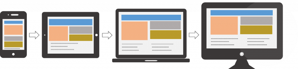
It is a design that adapts with device size. It means it is equally easy and usable at all screen sizes.
Screen sizes can range from as small as a smartwatch to as big as a TV. There can be numerous screen sizes in between but it depends on your user demographics which helps you decide which screen sizes you should design for.
Let’s see some of the examples
Example of non-responsive website:
https://dequeuniversity.com/library/responsive/1-non-responsive
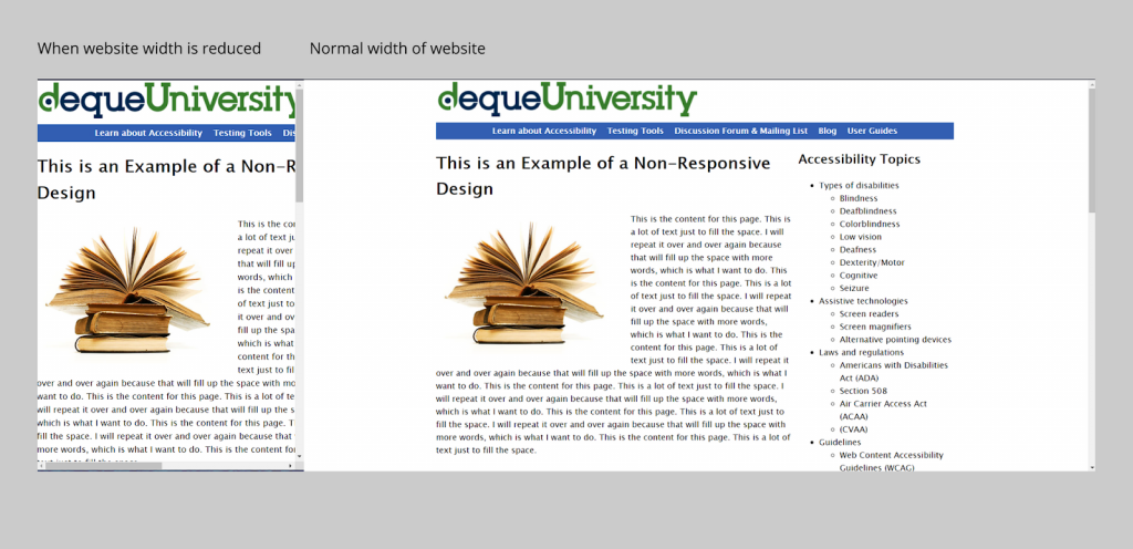
As you can see the website doesn’t adapt to the width of the screen size.
Whereas on:https://www.toptal.com/designers
The website changes itself accordingly with screen size.
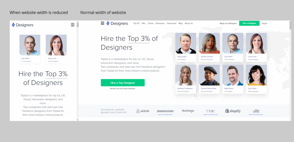
Hence, it is a responsive website.
But why should one design a responsive website/app? Why does it matter?
The next section answers this question.
Why responsive design?
Most probably most sites you visit daily are responsive, and this answers the question of why to go for responsive design. A responsive website is used more because it has better SEO (google has its parameters for it) and certainly more usable which directly translates to more visits and conversions.
And also with decreasing screen size and more people surfing on mobile than laptops users need usable products for small screens as well and if your product is not good enough the user might hop into your competitor.
You can take Google’s mobile-friendly test here: https://search.google.com/test/mobile-friendly
Okay, now you got why to build a responsive design but what are the different types of it and when to use which one?
Different types of responsive designs?
Before starting this part I would like to introduce you to a term called breakpoint which is a certain screen size at which the layout of the website changes.
It is generally advised to go with three breakpoints, i.e. for mobile, tablet, and PC.
Now you are all ready to start off
1- Fluid
This is a type of responsive design in which the design continuously adapts with changing screen size and doesn’t change its layout up to a breakpoint and when a breakpoint is reached it changes its layout and again continuously adapts without changing the layout till the next breakpoint is reached.

2- Fixed
In this type the layouts are fixed till the next breakpoint is achieved and no adaptation takes place in between, which basically means you are designing for a certain no. of screen sizes.
3 – Hybrid
As the name suggests in this both fixed and fluid are there, there is no adaptation till a certain breakpoint is achieved in the fixed one after it adaptation takes place according to the screen size in the fluid one.
How to make a responsive design?
Always start to think with the smallest screen in your mind because:
- Mobile websites have more usability concerns (this is mostly due to the lack of screen real estate), so it’s practical and more efficient for the primary focus to be on mobile design.
- It’s easier to scale up the mobile version than it is to scale down the desktop version (again, because of the lack of space on mobile websites).
- Mobile-first web design helps to reevaluate what’s visually and functionally necessary.
Designing a website as a mobile-first responsive site forces designers to ask a number of important questions because there is less screen real estate to work with. Here are the questions that need to be asked:
- Is this feature/function really necessary?
- How can we design something minimalist for mobile-first that will later scale up well for desktops?
Now the question comes is what are the screen sizes that you need to take care of while designing?
Here are the most common screen resolutions across mobile, tablet, and desktop users worldwide. As you can see, there is a wide range of resolutions, so neither mobile, tablet nor desktop is dominating the market share right now—what this tells us is that designers should consider all of them when thinking about responsive web design.
- 360×640 (small mobile): 22.64%
- 1366×768 (average laptop): 11.98%
- 1920×1080 (large desktop): 7.35%
- 375×667 (average mobile): 5%
- 1440×900 (average desktop): 3.17%
- 720×1280 (large mobile): 2.74%
Using grids and constraints
This is a guide on how to create a fluid responsive design because a fixed one can easily be made by just designing for the required no. of screens.
You can easily create fluid responsive designs using constraints and grids:
- create a canvas (preferably of 1280X800 px)
- Add horizontal grids, preferably 12 in number then give your margins and gutters accordingly.
- Add your elements like text, buttons, and pictures.
- Add a vertical center constraint to all of the elements
- Add horizontal constraint as left and right so that the same spacing is maintained between elements during scaling.
- If your text fields become too crowded by coming close to each other while scaling down then follow these steps:
- Add Autolayout to text fields so that the same spacing is between them too while scaling.
- Select individual text fields select constraint of fill container (this might lead to your autolayout frame resized, no need to worry, just resize it to the previous size,😉 )
- Select horizontal constraint of auto layout frame as left and right
- Just for the top navigation bar select its frame horizontal constraint to scale only if your navigation frame has the same width as the website frame.
And you are done. 😇
You will be able to see something like this:
Breakpoints- A Figma plugin for responsive design
There is a Figma plugin that you can use for the responsive design. You just have to make the screens for the different screens, add to it accordingly and select the range for a particular layout. After adding, you can see the screen size you want using the plugin.
It works even without the opened plugin window and anyone on your team can resize the frame without the plugin installed.
A one-minute tutorial is mentioned here:
► https://youtu.be/OaGSreqHCXE
The link to a plugin is:
https://www.figma.com/community/plugin/824289601590456356/Breakpoints
I hope this article will help you to design your first responsive website.