Fluid Typography and Responsive CSS in Web
In CSS responsive means something that is set to adjust or resize based on the breakpoint, aka media queries. Fluid is a new approach (not so new, just not put into use as much) which means something that adjust or resizes smoothly to match the device width. With Fluid approach we can practically support styling for all possible available screens and it is future proof, something that its counterpart Responsive approach lacks (not future proof, i.e. won’t support upcoming devices with varied resolutions).
For styling, we have two categories of units:
- Absolute Units
- Relative Units
Our main focus in this article is only on Relative Units, as Absolute Units are outdated (note: they will remain there always in CSS because for Relative to exist we always need something Absolute). Absolute Units are ‘pixel / px’ or ‘points / pt’ in CSS. Whereas, Relative Units are ‘em’, ‘rem’, ‘vh’, ‘vw’, etc.
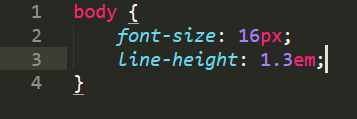
- em – It is based on the current font-size.
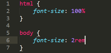
- rem – It based on the root element font-size (<html>).
- vh – It is based on viewport height.

- vw – It is based on viewport width.

Before moving on, let’s first get a clear understanding of what viewport is, on which everything that we are going to learn depends on, and by clear understanding I mean let’s a have visual.

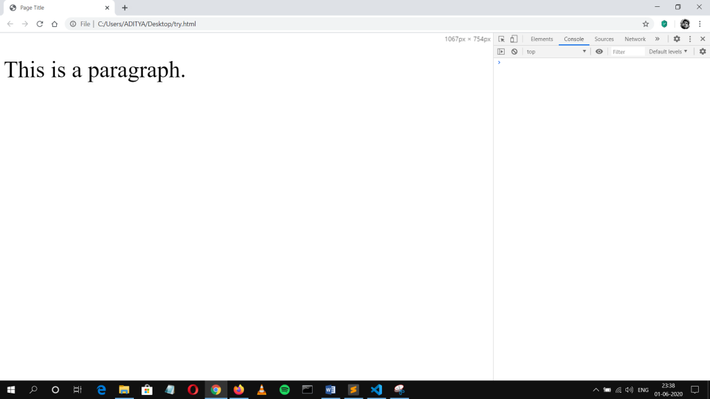
Fig – viewport size in pixel
So first let’s clear some misconception from the minds of beginner Frontend Developers about testing responsiveness in browser. If Pixel is an absolute unit which means fixed then it should appear same throughout different devices of varied resolutions (total number of pixels). Here’s a code I’m using.
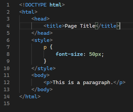
Let’s check the output on web
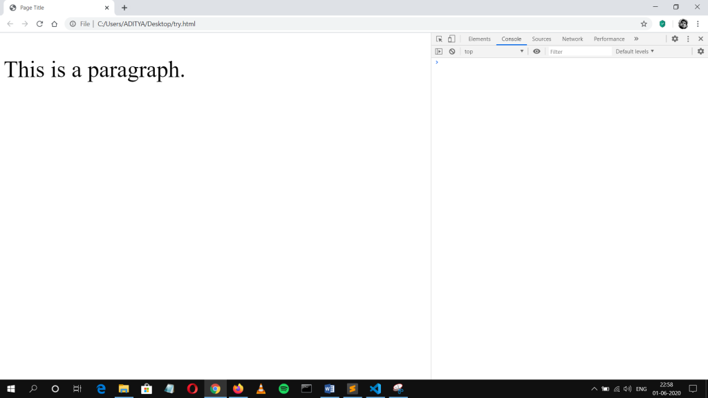
Now let’s simulate a device in browser’s Dev Tools.
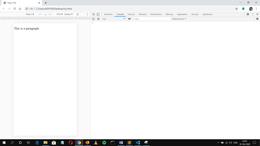
WHAT JUST HAPPENED, WHY IT DOES NOT LOOK SAME TO ME!!
Trust me there is nothing wrong with your eyesight. When you test your website on browser simulator for mobile devices, it creates a virtual viewport of around 1000px and then try to shrink and fit that virtual viewport in an actual viewport of mobile device which is of let’s say 600px. This is exactly what happened in second screenshot.
So the question arises, why browser behaves like that, well there is a reason for that. It does that to enable websites that are not properly styled for different screen sizes or no media queries are defined in stylesheet. Then that website automatically fits into mobile browser, it is as simple as that.
But there is an issue, let’s take a pause, understand everything that you have read up until now and think before reading further.
If you haven’t figured it out, no worries, this article is written with the sole purpose of figuring out that only. If you keep on reducing the device size or resolution, then ultimately the text would become unreadable and you won’t be able to read anything without zooming-in the webpage. This make our website not suitable for small devices. So what is the solution to avoid this auto-adjust behaviour of mobile browser? Here comes in the viewport Meta tag and below is the updated code (just added line 5).
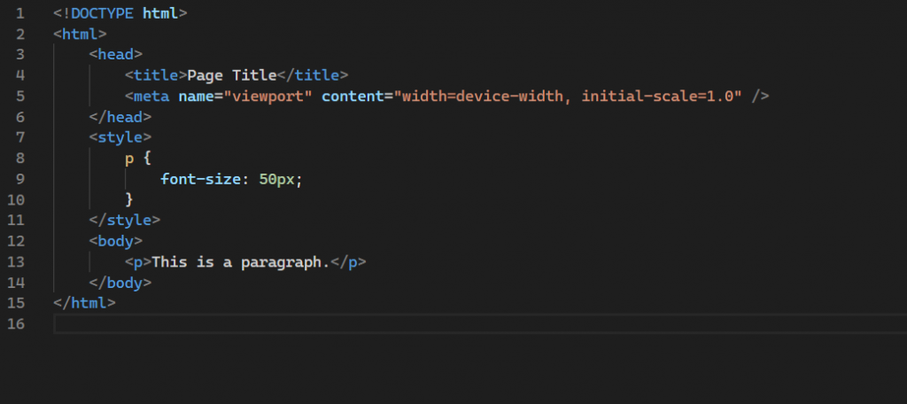
Let’s see how it affects mobile simulator view.
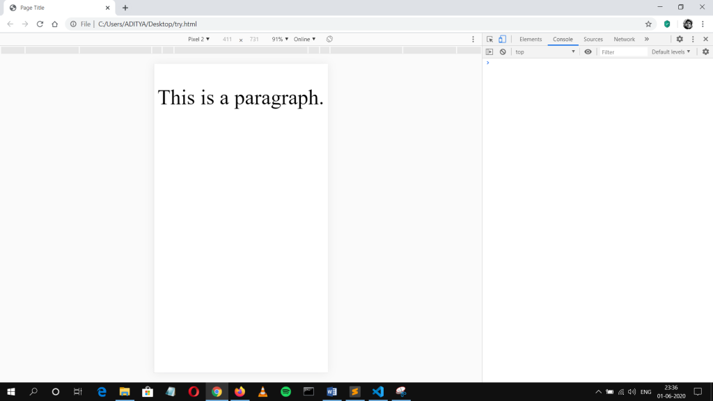
Now, it seems to behave properly. This Meta tag is basically telling any browser to adapt the width of the device and open initially with the scale of 1.0 (basically no auto-adjust or shrink to fit). This tag is present there in React by default, but we need to add manually if designing a website from scratch using HTML /CSS.
NOTE: IF YOU’RE WEBSITE IS NOT STYLED FOR RESPONSIVENESS ADDING THIS TAG CAN CREATE DISASTER.
Ok, let’s jump to how to use absolute units properly for Fluid CSS. It can be done with a method available in CSS called ‘calc()’ and making a mathematical formula out of it. A web designer known by the name Tim Brown first wrote a formula to calculate line-height. Then, a web developer called Mike Riethmuller applied same formula for font-size. Here’s how formula looks like.
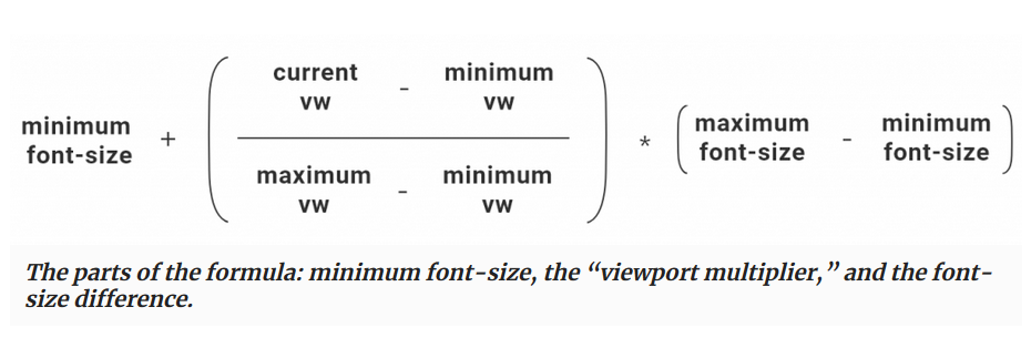
Suppose we want minimum font-size of 16px for viewport of 420px and maximum font-size of 24px for viewport of 1000px then that’s how CSS would look like.
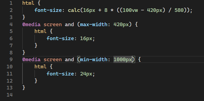
This formula basically controls the rate at which the font-size would scale depending upon the parameters used and to limit the range we have to use media queries as applied here.
This formula might look complex in first sight, but it is very simple to understand and implement. And it is made complex just to have more control over the font-size for different viewport sizes in a smooth manner.
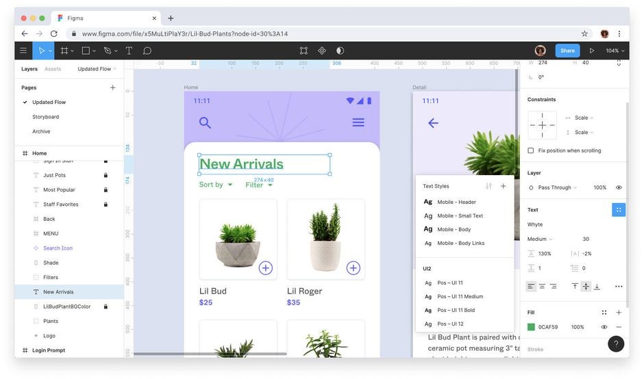
Here’s a screenshot of Figma tool, which is a UI designing tool. To understand the above mentioned formula, one should first understand the process of designing first. It’s very simple to understand, a UI designer frames the layout on a standard frame size or standard viewport size (by standard I mean the size chosen by most manufacturers). Suppose a UI is designed on frame size of 1280px and everything else like font-size or margin is defined in pixels based on what’s fit for that particular viewport, then it automatically means that it is not suitable for all available devices and to solve this problem we have to use Mike’s formula. Having the base units makes it easier for everyone to write their own scaling formula. The formula can be different for different developers based on their requirements of maximum and minimum values of required parameters.
You will notice that similar approach is taken in React Native when handling font-size fluidly for different devices. Here, a question arises that when everyone is using this approach for mobile then why not for web. The answer here is simple, when screen size reduce or resolution (total number of pixels) is reduced, then font-size, margin, padding related issues become quite noticeable which is not the case in web and they are generally ignored, which in my view completely wrong.
Even I have recently adapted this new approach and discovering its benefits and different use cases along the journey of my professional life as a Frontend Developer. There is no one silver bullet to make use of this approach. Here’s what I think as of now from experience is the best way to use this formula in CSS.
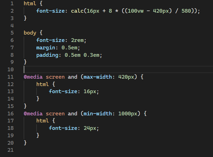
Rules:
- Define root font-size using Mike’s formula for Fluid Typography.
- Define all other elements font-size using ‘rem’ unit.
- Define margin and padding using ‘em’ unit.
- Limit font-size and other properties using media queries.
I would encourage everyone who read this article to start using Fluid approach more and more in their future projects as it makes more sense than Responsive approach and gives you more control over styling for different devices. In my experience, mixed approach is always the best way for anything which basically means to use best from both the approaches.
I have tried to explain this complex concept in a simpler and broken-down language as I can so everyone who is reading this will find it easier to understand.
 End to End Technology Solutions
