Syncfusion is a software company that provides a wide range of components and tools for building cross-platform applications, including Flutter. They offer a set of Flutter widgets, including charts, to help developers create interactive and visually appealing data visualizations in their Flutter applications.
Syncfusion’s Flutter charts also provide a wide range of customization options, interactivity features like tooltips and selection, and support for real-time updates, making them a powerful choice for building data-driven Flutter applications. All the major features and customizing options are available for the axes in the Syncfusion Flutter Charts widget.
Add Flutter Charts to an application
Add dependency
To add Flutter Charts to your Flutter application, you’ll need to follow a series of steps, including importing the necessary dependencies, creating a chart widget, and configuring your data.
Open your project’s pubspec.yaml file and add the Syncfusion Flutter Charts dependency. You can find the latest version on the Syncfusion Flutter Charts page.
Dependencies:
syncfusion_flutter_charts: ^your_version_here
Axis elements
Customizing axes in Syncfusion Flutter Charts allows you to control the appearance and behavior of the chart’s axes to better suit your data visualization needs.
Here are some common customization options for axes in Syncfusion Flutter Charts:
● Axis line
● Axis title
● Major and minor grid lines
● Major and minor tick lines
● Axis labels
Axes customization features
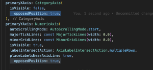
1. Opposed axis
you can create opposed axes by adding additional axes to your chart.
Opposed axes are typically used in scenarios where you want to display multiple series of data with different scales or units on the same chart.
Here’s how you can create opposed axes in Syncfusion Flutter Charts:
opposedPosition:true
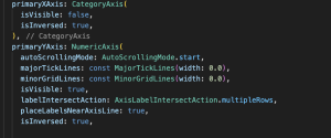
2. Inversed axis
you can create an inversed or reversed axis by using the isInversed property.
By using the isInversed property, you can effectively create inversed or reversed axes in Syncfusion Flutter Charts to suit your specific data visualization requirements.
Here’s how to do it for both X and Y axes:
isInversed: true
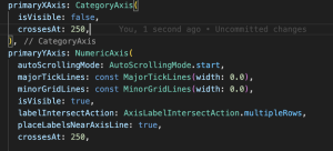
3. Axis crossing
In Syncfusion Flutter Charts, you can customize the axis crossing point using the crossesAt property.
Here’s how to set the axis crossing point for both the x-axis and y-axis:
crossesAt :250
4. Multiple axes
Multiple axes in a chart are used when you want to display multiple data series with different units or scales on the same chart.
Syncfusion Flutter Charts allow you to create multiple axes, both primary and secondary, to accommodate these scenarios.
Primary Axes: The primary axes are the default axes created automatically when you define your chart. You can customize these axes based on your needs. Secondary Axes: Secondary axes are additional axes that you can add to your chart. These can be positioned either horizontally (top or bottom) or vertically (left or right) depending on the axis type and your data.
Here’s how you can create and configure multiple axes in Syncfusion Flutter Charts:
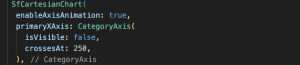
5. Axis Animation
Axis animation in Syncfusion Flutter Charts refers to the smooth transition or animation effects applied to the chart’s axes when the chart is initially rendered or when data is updated.
These animations make your charts more visually appealing and help users understand changes in data over time.
Syncfusion Flutter Charts provides various built-in animations for axes.
Enable Animation for Axes: To enable axis animation, set the animateAxis property to true for the specific axis you want to animate. This property is available for both primary and secondary axes.
Animation Duration: You can control the duration of the axis animation using the animationDuration property. This property sets the time, in milliseconds, for the animation to complete.
Easing Curve: Syncfusion Flutter Charts also allows you to customize the easing curve of the axis animation using the easingType property.
You can use different easing types like linear, easeIn, easeOut, easeInOut, etc. Here’s how to enable axis animations:
enableAxisAnimation: true
animationDuration: 1000,
easingType: EasingType.easeInOut,
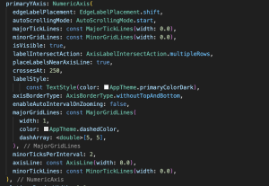
6. Edge label placement
Syncfusion Flutter Charts provides options for customizing the placement of axis labels to ensure they are well-positioned and do not overlap or clutter the chart. Label Position:
You can set the labelPosition property of the CategoryAxis to control the placement of labels on the x-axis.
The available options are outside, inside, and betweenTicks.
outside: Labels are placed outside the axis line.
inside: Labels are placed inside the axis line.
betweenTicks: Labels are placed between the tick marks.
edgeLabelPlacement: EdgeLabelPlacement.shift
labelPosition: LabelPosition.outside,
labelRotation: 45,
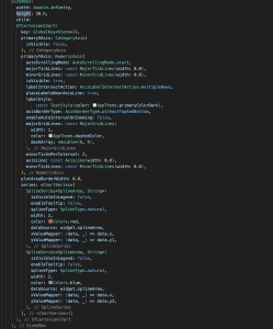
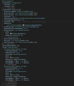
Complete Code Example –
Here’s a basic example of how to create a chart using the Syncfusion Flutter Charts package: