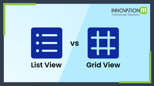
ListView is the Flutter widget commonly used scrolling widget, It displays children one after another in a scrolling page. children scrolling on the main axis and also it has to fill the cross axis of the listview.
If the item value is non-null the item auto adjust in a scrolling way, Specifying an item extension is more efficient than letting the children determine their own extent because the scrolling machinery can make use of the foreknowledge of the children’s extent to save work
There are four-way to create a ListView
- Using Default Constructor
- Using ListView.builder
- Using ListView .separated
- Using ListView.custom
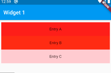
ListView Creation using default constructor:——-
It takes a list of children of the widget
ListView(

List<Children>(    )

);
This is efficient when you have a limited number of a child because all item preloaded in memory
ListView( padding: const EdgeInsets.all(8),

 children: <Widget>[ Container(

height: 50,

 color: Colors.amber[600],

 child: const Center(child: Text('Entry A')), ),

 Container( height: 50, color: Colors.amber[500],

 child: const Center(child: Text('Entry B')), ),

 Container( height: 50, color: Colors.amber[100],

child: const Center(child: Text('Entry C')

),

 ),

 ],

 )
ListView Creation Using ListView.builder:——-
ListView.builder constructor takes indexedwidgetBuilder which build child dynamically
ListView.builder(

Itemcount:listofchild.size,

itemBuilder:(context,index){

Return ListTile(

title:Text(“Hi this is title”);

)

}

)
This is efficient when you have a large number of a child because the builder method execute only for those elements which are showing on the screen
ListView.builder(

  padding: const EdgeInsets.all(8),

  itemCount: entries.length,

  itemBuilder: (BuildContext context, int index) {

    return Container(

      height: 50,

      color: Colors.amber[colorCodes[index]],

      child: Center(child: Text('Entry ${entries[index]}')),

    );

  }

);
ListView Creation Using ListView .separated:——
ListView.separated constructor takes two parameter
- indexWidgetBuilder:itemBuilder
- separaterBuilder
site builder build child on demand and separaterBuilder build separate between the child
ListView.separated(

  padding: const EdgeInsets.all(8),

  itemCount: entries.length,

  itemBuilder: (BuildContext context, int index) {

    return Container(

      height: 50,

      color: Colors.amber[colorCodes[index]],

      child: Center(child: Text('Entry ${entries[index]}')),

    );

  },

  separatorBuilder: (BuildContext context, int index) => const Divider(),

);
ListView Creation using ListView.custom:——-
Listview, the custom constructor takes silver child delegate which provides the ability to create a custom child model
ListView(

  shrinkWrap: true,

  padding: const EdgeInsets.all(20.0),

  children: const <Widget>[

    Text("I'm dedicating every day to you"),

    Text('Domestic life was never quite my style'),

    Text('When you smile, you knock me out, I fall apart'),

    Text('And I thought I was so smart'),

  ],

)
Child element lifecycle:——
- Creation
- Destruction
Creation:-
When the child displaying on the screen, called the creation phase
Destruction:-
When a child scrolling out of view it automatically destroys and erases from memory
GridView
GridView is a widget in a flutter that used to display the element one after another or we can say that GridView is used to display the child in 2-D Array
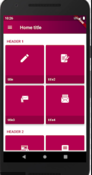
GridView can implement in a various way:—
- Using count
- Using builder
- Using extent
Using GridView.count()
GridView.count is commonly used way because we have known child-size so developer know about the number of row and column
Parameters of GridView.count()
- crossAxisCount: it is used to declare the number of column in the view
- crossAxisSpacing:- it is used to declare the spacing the between child listed in cross-axis
- mainaxisspacing:- it is used to declare the spacing the between child listed in the main axis
- scrollDirection:- is used to define the scrolling direction of child
- reverse:-it reverse the list in the opposite direction
- physics:-it used to determine how list behave when we reach start to end
Example;-
GridView.count(

                crossAxisCount: 3,

                crossAxisSpacing: 4.0,

                mainAxisSpacing: 8.0,

                children: List.generate(choices.length, (index) {

                  return Center(

                    child: SelectCard(choice: choices[index]),

                  );
GridView.builder()——
GridView.builder comes in role when we have large amount of data. the GridView.builder() construct takes SliverGridDelegateWithFixedCrossAxisCount and SliverGridDelegateWithMaxCrossAxisExtent
The common attribute used
Itemcount:-the number of child you want to display
gridDelegate:- it determines the grid, its argument should not be null
itemBuilder:-it is used to create the item that will be displayed on the screen
Note :-t will be called only when the indices >= zero && indices < itemCount.
GridView.builder(

              itemCount: images.length,

              gridDelegate: SliverGridDelegateWithFixedCrossAxisCount(

                  crossAxisCount: 2,

                  crossAxisSpacing: 4.0,

                  mainAxisSpacing: 4.0

              ),

              itemBuilder: (BuildContext context, int index){

                return Image.network(images[index]);

              },

            )),

      ),

    );
GridView.extent()—–
GridView.extent() is used to customize the view with custom extent means each tile has maximum tile extent
GridView.extent(

            primary: false,

            padding: const EdgeInsets.all(16),

            crossAxisSpacing: 10,

            mainAxisSpacing: 10,

            maxCrossAxisExtent: 200.0,

            children: <Widget>[

              Container(

                padding: const EdgeInsets.all(8),

                child: const Text('First', style: TextStyle(fontSize: 20)),

                color: Colors.yellow,

              ),


              Container(

                padding: const EdgeInsets.all(8),

                child: const Text('Four', style: TextStyle(fontSize: 20)),

                color: Colors.yellow,

              ),

              Container(

                padding: const EdgeInsets.all(8),

                child: const Text('Fifth', style: TextStyle(fontSize: 20)),

                color: Colors.yellow,

              ),

              Container(

                padding: const EdgeInsets.all(8),

                child: const Text('Six', style: TextStyle(fontSize: 20)),

                color: Colors.blue,

              ),

            ],

          )),

    );
Linear Gradient
Linear gradient as per name this gradient flows over a simple linear stretch. Over this stretch is a smooth color transition, This is used in BoxDecoration for decoration of child, it consists of two main parameters as
- Begin value lie between 0.0 and 1.0
- End value lies between 0.0 and 1.0
Note:- the value is infraction so the same gradient use for varying sized boxes without changing the parameter.
The color describes by the list of color objects, There must be at least two colors in two colors. it specifies the fraction of vector from start to end between 0.0 and 1.0 for each color. if the value will null color uniformly distribution happen.
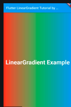
Example:-
BorderRadius.circular(15),
splashColor: Theme.of(context).primaryColor,
child: Container(padding: EdgeInsets.all(15),
child: Text(title),
decoration: BoxDecoration(
gradient: LinearGradient(colors: [color.withOpacity(.7),color.withOpacity(.5)],
begin:Alignment.topLeft,
end:Alignment.bottomRight ),
borderRadius: BorderRadius.circular(15)
),
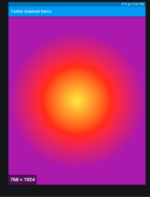
Radial Gradient:—
This is another very important key for designing, This type of gradient changes its color with respect to the center point.
Container(

  decoration: BoxDecoration(

      gradient: RadialGradient(

        colors: [Colors.yellow, Colors.deepPurple],

        // Add one stop for each color

                 // Values should increase from 0.0 to 1.0

                 stops: [0.1, 0.5, 0.75]

    ),

  ),

),
Like linear-gradient, color class contain at least two-color, and values should lie between 0.0 and 1.0
 End to End Technology Solutions
