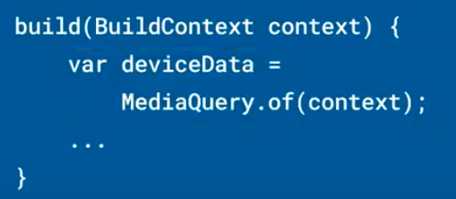
Some applications must adjust their layout depending on system configuration in order to have the best user interface. To get the current system details in Flutter, we can use MediaQuery. Creates a subtree where media queries are resolved to the specified data. For example, you can read the MediaQueryData. size property from the MediaQueryData returned by MediaQuery to learn the size of the current media (e.g., the window containing your app).
- If you are writing an app for both phones and tablets you’ll want to have different UI layouts for different screen sizes.
- You might find yourself in a similar situation if the user has a preference set for much larger font size or wants to minimize animations.
- Media Query will help you to detect which size device you are on, as well as user preferences, and help build your layout accordingly.
- Layout builder which could tell you how much space a particular widget has available.
- Media Query provides a higher-level view of your app’s screen size and can provide more detailed information about user layout preferences.
- In practice, Media Query is always there, you just access it by calling MediaQuery.of in your build method.

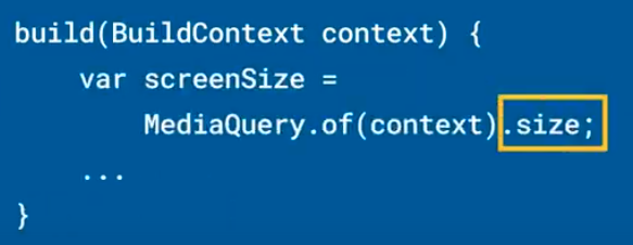
- You can get the screen size information by calling the below mentioned build method.

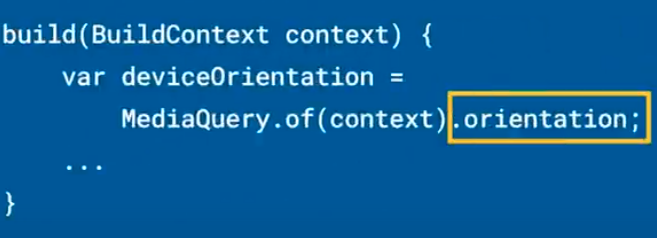
- Media Query also allows you to check your device orientation.

- Or determine if the user has modified the default font size.

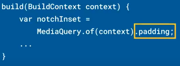
- We can also check out the parts of the screen that are obscured by a system UI, much like a lower level safe area widget.

- We can look up some interesting accessibility information, like whether the device is requesting you limit your animations or the level of the screen contrast.


- Now what you really need to know is that with MediaQuery.of(context).size.width, you can retrieve the width of the screen and the height of the screen with MediaQuery.of(context).size.height. You can get a Size object for both dimensions with only MediaQuery.of(context).size if you want to get one.
 End to End Technology Solutions
