Flexbox – This term is also called the Flexible-Box which was introduced in 2009. It is a CSS3 Layout that provides a way to arrange items within a container, basically, it is a flexible container with several properties namely width, height position, etc.
If you’ve used CSS for a while you have probably been using “the old block model(for sections), Table (for 2D table data), Inline(for text), Positioned(for the position of an element) in all these methods you have to assign widths whether it’s a percentage or a fixed width and then you use floats to arrange items on the webpage, if you have to show three boxes in a row then by using these methods you have to do factor for the margins and paddings which is somehow a complex way, So to avoid all these we can use flex which is easier to use with zero complexities.
FLEXIBLE BOX MODEL:

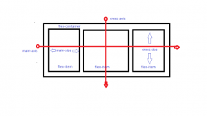
This flex model shows the structure of the flex items inside the flex container, with the help of the main axis which is used to move the flex items between main-start to main-end, and similarly for the cross-axis which is vertically aligned.
FLEX PROPERTIES
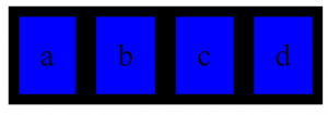
In Order to use flex inside an HTML document to display the flex layouts, we have to use display property i.e, display: flex and display: inline-flex, however, they both are the same the only difference is inline displays the elements in the same line.

Let us have a look at how do we add the CSS flex properties inside an HTML webpage.

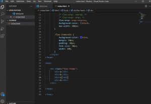
This is the representation of the division tag inside the body of the HTML, and inside it, we have to add the CSS style, now we have to add the flex items inside the flex container,
- Flex Direction: This property is used to define the flex items from left to right, Right to left, top to bottom to bottom to top.
![]()
- Flex-Wrap: This property is used to wrap the items into multiple lines from top to bottom or vice-versa.
![]()
- Flex-Basis: This property is used to define the default size of the element, it can be keyword (auto, content, etc.) or length (10rem, 2em, 5%, 4px, etc.). The auto keyword means that it takes the width and height according to the main size of the flex container and the width and height of the content keyword are always set according to the content inside the flex items.
![]()
- Flex-Grow: The flex-items have the ability to grow if needed, and it only takes the numbers, if any flex-item has the value 2 then that item grows twice the others or if every item has the same value then it is by default sets the width according to the flex container.
![]()
- Flex and Flex-Shrink: Flex-Shrink has the ability to shrink according to the flex-container with the help of numbers. On the other hand, Flex is used instead of flex-grow, flex-shrink, flex-basis, we can use these all properties inside the flex only, we can also say that flex is the shorthand for all these three.

- Justify-Content: This property is used to distribute the extra space of the flex container at the start, end, or in between the flex items towards the main axis.
![]()
- Align-Self: This property is used for individual flex-item for default alignment.
![]()
- Align-Items: This property is used for cross-axis to align items inside the flex-container from top to bottom, you can also take this as justify-content for cross-axis
![]()
- Align-Content: This is used to distribute the extra space between the flex-items inside the flex-containers towards the cross-axis which is perpendicular to the main axis.
![]()
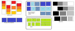
So, at the end let us see the representations of Flex properties, through which you will have a neat idea about flex and its properties which are more flexible & more helpful to use for designers.

 End to End Technology Solutions
