CSS Grid is a powerful tool that allows for two-dimensional textures to be built on the web. This guide is designed as a tool to help you better understand and read the Grid, and is organized in a way that I think makes a lot of sense as you read.
Grid Container
Create a grid container by setting the display item by grid value or inline-grid. All direct children of grid containers become grid objects.
Like tables, grid layout enables the author to sync objects in columns and rows. However, many configurations are possible or easier with the CSS grid than were the case with tables. For example, children’s items in grid containers can place them on their own and therefore are actually intertwined and layered, similar to objects placed in CSS.
{

display: grid

}
Grid items are placed in rows by default and span the full width of the grid container.

Grid-template-columns:
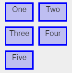
The grid-template-columns CSS property defines the line names and track sizing functions of the grid, giving below.
{

grid-template-columns: 60px 60px ;

}
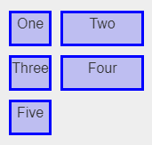
{

grid-template-columns: 1fr 2fr;

}
Grid-column-start:
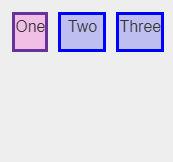
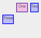
The grid-column-start CSS property specifies a grid item’s start position within the grid column by contributing a line, a span, or nothing (automatic) to its grid placement. This start position defines the block-start edge of the grid area.
{

grid-column-start: auto;

}
{

grid-column-start: 2;

}
Grid-gap :
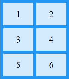
The gap CSS property sets the gaps (gutters) between rows and columns. It is a shorthand for row-gap and column-gap.
{

display: grid;

grid-template-columns: auto auto;

grid-gap: 10px;

}
 End to End Technology Solutions
