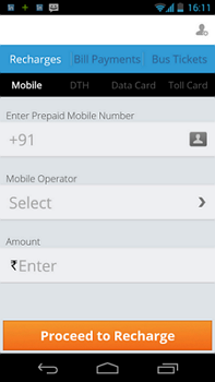
Sliding Effect (Parent partially visible)
In this example, operator has to be selected. User taps on the field and the screen moves / slides to the left to give space to show the list.
Good points:
– Parent screen is visible. Very good from UX perspective that user still knows the context where it started from. Makes user more confident in what he is doing.
Improvements:
– Parent field name is not visible. It can be made visible and also that field should be highlighted telling user as to for which field he is selecting the data.
 End to End Technology Solutions


